TouchGFX 4.20 is now available for download. With this version, we aim to help developers share their creations with their teammates and with the world better. Indeed, we are now offering a way to export custom containers. Designers will thus have the tools to share specific design elements across projects. TouchGFX 4.20 also brings significant performance optimizations when using vector graphics. Developers will, therefore, be able to share smoother animations with their customers or provide more complex interfaces. As is often the case, this new version of the framework ensures that rich UIs can run on a wider range of MCUs and that teams reduce friction to improve their creativity.
What Is TouchGFX?
The Framework
TouchGFX is ST’s free-to-use framework that helps create graphical user interfaces on STM32 microcontrollers. Written in C++, the engine takes advantage of optimizations on ST devices. TouchGFX works under the assumption that interfaces consist of screens users navigate. Hence, the framework is intuitive and reflects one’s experiences. It is also extensive as it handles 2D and 3D objects, videos, animations, transitions, etc. Additionally, the ability to access the code generated allows expert engineers to optimize it. To help them in the process, TouchGFX Documentation provides information on the framework’s APIs or available development tools.
TouchGFX Designer
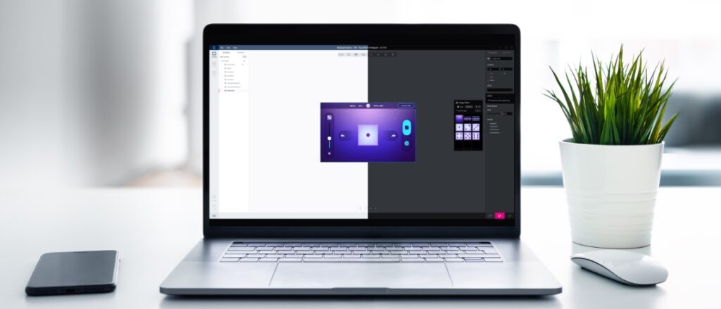
TouchGFX Designer is often the first tool developers use when starting their UI. It’s a utility with a WYSIWYG approach where designers create what their users will see and interact with. Developers can start with example projects, such as a clock, gauge, or animated image. There are also more full-fledged demos like a dice animation, scene transitions, or a pool monitoring system. A startup screen helps choose the demo application, an ST development board, and then configures everything. Hence, running example codes and demos takes minutes, which means creating proofs-of-concept faster. UI elements in TouchGFX Designer often take the form of widgets one adds and configures through the utility’s interface.
TouchGFX Designer is an integral part of the TouchGFX ecosystem. For instance, as long as users choose a 3.0 template, it is possible to start the project in Designer, then take it to STM32CubeMX, set up the Discovery board or MCU, and let TouchGFX Generator (see below) update the .IOC file to apply the new settings immediately. Similarly, a developer can start with TouchGFX Generator, move to TouchGFX Designer, then go back to STM32CubeMX to change the display resolution. The system will automatically update TouchGFX Designer without needing to close the application.
TouchGFX Simulator
TouchGFX Simulator helps developers preview their graphical user interface before running it onto their MCU. Part of its appeal is that it offers keyboard shortcuts to streamline workflows. For instance, it is easier to take various screenshots and study animations frame by frame. Similarly, pressing F2 highlights invalidated areas, meaning the sections of the frame that the system must update. As a result, developers can check if their animations waste MCU resources by unnecessarily invalidating assets.
TouchGFX Generator
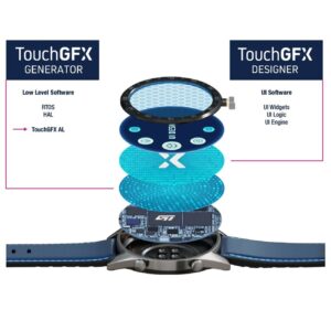
TouchGFX Generator works with STM32CubeMX to generate a significant portion of the TouchGFX abstraction layer. We support nearly all STM32 Discovery Kits with a display, and the new plugin works with any STM32 MCU with a Cortex-M0+, M4, or M7. Developers still have to fill some blanks with their user code and perform optimizations, but this new plugin makes starting a project a lot more straightforward. Indeed, Generator creates empty functions to guide developers and facilitate board initialization. There are also existing default setups for the ST development boards to hasten developments and serve as examples.
What’s New in TouchGFX 4.20?
Exporting Custom Containers
In its most simplistic form, TouchGFX Designer relies on widgets, a representation of a feature drawn on the screen. The software comes with many predefined widgets, such as a gauge, clock, or graph, and developers can design their custom widgets. To make widgets more straightforward, designers can group them inside a container. Containers are often the building blocks of an interface. They enable programmers to reuse a set of widgets across multiple screens without having to reconfigure them every time. Additionally, modifying a container impacts every screen using it, which vastly simplifies developments. TouchGFX also comes with predefined containers to hasten the most common design operations and developers can create custom containers.
Custom containers are highly popular because they enable developers to tweak their interface and flesh out a precise vision. The inherent challenge behind any design tool, however, is that the work spent on one project can almost never be exported to another UI. Indeed, a custom container includes code, graphical assets, texts, dependencies, and more that ties it to its existing project. TouchGFX Designer 4.20 solved this issue by offering an export feature that creates a bundle (.tpkg file) that’s reusable on other projects. The utility will add all assets, including fonts, to the bundle and an XML file lists its content. Developers can therefore check that file and modify it to select what they would like to export.
Importing Custom Containers
To import a custom container, users select Edit -> Import -> Custom Container. TouchGFX 4.20 includes a new import utility that guides users through the process. For instance, the software detects the languages defined by the custom container and matches them to those available in the new project or ignores them. The system will also halt the import process if there’s a conflict between generic names or if an issue could cause problems inside the new interface. TouchGFX Designer forces users to fix issues on the original custom container, instead of creating workarounds during the import process. As the feature’s purpose is to preserve the look and feel of interfaces across products, forcing changes inside the original project ensures consistency across UIs.
Vector Optimizations
Most static interfaces on microcontrollers use bitmaps because they require so little computational throughput. Comparatively, vector images are less common because they need a lot more computing power. The challenge is that vectors are essential for animations. As a result, developers may choose to use more resources to provide a smoother animation thanks to a higher number of frames per second. Alternatively, the animation can use less power and be less fluid. TouchGFX 4.20 offers significant optimizations when processing vector graphics with an increase in efficiency of up to 70% in some cases. Developers can thus offer smoother animations on smaller MCUs or use more vector elements. However, developers will see the biggest performance gains on larger animations.
The new optimization utilizes Chrom-ART to offload the microcontroller during certain operations like color fills. ST also updated the way the framework computes the edges of a shape. Moreover, since the updates pertain to the framework’s handling of vector graphics, users automatically benefit from them. Developers will thus see performance boosts immediately and can plan accordingly. Some may choose to lower their application’s memory requirement or decide to add new animations to their interface. Teams may also have to review their UI because some elements may run at a faster rate than expected.
What Features Are Already in TouchGFX?
Support for X-NUCLEO-GFX01M2 and X-NUCLEO-GFX02Z1
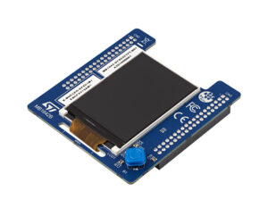
When engineers decide to have a graphical user interface, the display often becomes the single most expensive component in their bill of materials. A simple 2-inch display with no touch layer will significantly improve the user experience, but it’s still more costly than anything else. Sourcing an affordable display, when aiming for a BoM of five dollars or less, is thus problematic. As a result, ST is shipping display expansion boards to help engineers find cost-effective parts, and we are offering support for the hardware within TouchGFX Designer. Users choose the display’s configuration and can start working on an interface that matches its specifications.
The first expansion board engineers can choose is the X-NUCLEO-GFX01M2. It uses an SPI 2.2-inch QVGA (320 x 240) display that supports SPI flash, and that would fit a BOM of about five dollars for a typical embedded system with external flash and a two-layer PCB. The X-NUCLEO-GFX01M2 is compatible with a broad range of 64-pin NUCLEO boards. For instance, engineers can use it on the NUCLEO-WB55RG to help make Bluetooth applications more accessible.
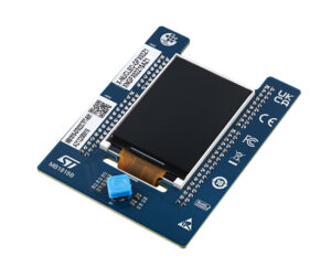
Similarly, the X-NUCLEO-GFX02Z1 is our first display expansion board to support a parallel interface, QSPI flash, and Nucleo boards with 144 pins. The platform targets microcontrollers with more power, which explains the compatibility with interfaces that offer higher bandwidths. Developers can use the X-NUCLEO-GFX02Z1 with the NUCLEO-U575ZI-Q that came out with the first STM32U5s. It thus enables engineers to take advantage of the better performance-per-watt ratio of the new MCU to create user interfaces that weren’t possible on previous generations of STM32s.
Embedding Videos in UIs
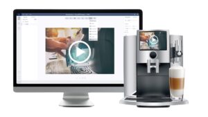
The desire to bring videos to more UIs is a natural consequence of the growing popularity of displays on embedded systems. Unfortunately, showing a video on an embedded system with a microcontroller is challenging. There is no operating system with a default media player and codecs. Similarly, writing a web page showing a YouTube video is impossible. Developers have to do all the heavy lifting, such as implementing a video buffer, figuring out what format would work best on their microcontroller, and determining how to take advantage of hardware acceleration if available. TouchGFX Designer offers a video widget to solve this challenge. Hence, adding a video now only requires three straightforward steps.
CacheableContainers
As the name implies, it uses a bitmap cache to accelerate graphical performance and enable a higher frame rate for smoother transitions. The demo below runs on an STM32F429I Discovery kit. Without CacheableContainers, the simple full-screen (240 × 320) slide animation runs at nine frames per second. With the TouchGFX technology, the system reaches 60 frames per second. Some smartwatches currently use this feature to ensure a seamless user experience despite the significant hardware limitations inherent to their form factor and the need for more battery life. Beyond animations, CacheableContainers can optimize complex widgets, such as texture mappers or small dynamic elements displayed in front of a static background.
Without CacheableContainers, an animation must redraw every frame, which can get computationally expensive. CacheableContainer bypasses this problem by storing the first and last frames in a separate container in the form of a bitmap that the system keeps in the RAM. Instead of rendering the animation, the system retrieves the two images from memory using DMA and shows them at different places thanks to a simple DynamicBitmap method. The MCU no longer generates every frame, thus significantly optimizing performance. Developers only need to tick the Cacheable box in TouchGFX Designer, select the location in memory of the containers they want to cache, and call them when needed. With this technique, the render time drops from 100 ms to 5 ms.
Partial Framebuffer
A frame buffer is a contiguous memory space that stores a representation of each of the pixels that will appear on display. For example, a standard 24-bit 390 x 390 image for a smartwatch display demands a frame buffer of 3,650,400 bits or 456.3 KB ((390\times390\times24)\div8), which is more than 70% of the SRAM available on the STM32L4+ that excels on smartwatches and wearables. And this number can explode if an application requires more than one frame buffer. Beyond the capacity limitations, a large frame buffer takes longer to fetch as more data must travel from the memory to the display, slowing down performance.
As the name indicates, Partial Framebuffer only stores a portion of the frame buffer, thus reducing its memory footprint by 10. Developers can configure its size according to the section of the screen that will change and then store multiple partial buffers. The framework will then choose the appropriate one and send it to the display. The technology works best with short animations, like clocks, loading bars, or a graph that builds itself over time. It also demands that the screen use an embedded controller as it will directly receive the partial frame buffer from the MCU’s RAM, thus bypassing the flash for added performance. The technology works on Parallel / 8080, DSI, and SPI displays.
TouchGFX also optimizes the partial frame buffer to bring UIs to resource-constrained microcontrollers. Traditionally, a minimal graphical interface would require a frame buffer of about 200 KB. However, when a microcontroller like the STM32G071 has only 36 KB of RAM, it can be a real problem. TouchGFX solves this by optimizing the partial frame buffer to only six kilobytes. Accounting for the framework’s application data, an entry-level UI would only need 16 KB of RAM to run. TouchGFX also uses smart partial screen updates. The functionality complements partial frame buffering to optimize the order of updates on the screen. The process saves resources, thus allowing more updates during the same period.
L8 Compression Format
Graphical assets take a lot of space in memory, and reducing their quality means downgrading the user interface. L8 is thus an essential feature because it can compress an image file by up to 75% with no downgrade, thanks to the Chrom-ART accelerator present in STM32 microcontrollers. As long as an asset uses a maximum of 256 colors, which is very often the case on small embedded systems with an STM32 MCU, developers can choose to compress an asset using the L8 format by merely ticking a box in TouchGFX Designer. Decompression is also computationally efficient as it uses the Chrom-ART engine to look up colors in a table and render the asset without loss of quality.
XML File for Text
Design teams often store text in an Excel file to work with various translators worldwide. However, instead of using version control systems, such as Git, editors have to manually handle changes and make sure no one inadvertently overwrites someone else’s work, which can be cumbersome. To solve this problem, TouchGFX stores all text in an XML file. The format makes merging operations and conflict resolutions a lot simpler. TouchGFX also includes an XML to Excel converter to fit existing workflows. Developers can export to Excel and then import their Excel file back into TouchGFX and its XML format.
Optimized Project Files
TouchGFX also fosters collaboration thanks to small project files. Their size makes them easier to merge and potentially share. Previously, project files stored all parameters in a JSON format. The problem is that such a file can get quite large. ST, therefore, decided to optimize project files by only storing custom settings. Therefore, anything that isn’t in the file is treated as using a default value. Consequently, the file is much smaller, making merging operations on Git far more straightforward and faster.
Single-Use Text and Its Random ID
Developers wishing to use text must create a resource in the text panel of TouchGFX Designer and then use the text’s ID in the UI. However, TouchGFX also allows for “single-use text”, which doesn’t appear as a typical text resource. Developers use it during testing or if a text isn’t important. It prevents filling up the database with irrelevant texts and helps prototype faster. Indeed, the single-use text feature automatically generates an ID and erases the resource from the database if deleted from the UI, unlike regular text resources. TouchGFX also uses a random string generator for ID creation. As a result, it’s nearly impossible for two single-use text IDs in the same project to be identical.
Animations and Widgets
Slide-in Transitions and Dynamic Graphs
The challenge for developers is to take advantage of all the features we keep adding to TouchGFX. Hence, we offer optimized animations that already use the features above. For instance, while a traditional slide-in transition requires an entire screen refresh, TouchGFX’s wipe animation uses far fewer resources. Similarly, the dynamic graph widget shows sequential data better with less impact on the RAM and the microcontroller.
Static Graphs
As wearables track environmental or physical data, users want to see progress. Graphs can track heart rates, temperatures, steps walked, and more. TouchGFX developers first asked for dynamic graphs, as they can be challenging to implement, and the feature has been available since TouchGFX 4.15. Now, our teams are releasing static graphs to accommodate new applications. Indeed, data that doesn’t need to evolve constantly or knows only slight variation over time better suits a static representation. The new graphs work slightly differently. Developers only need to send one data point on a dynamic one since the time interval is constant. However, on static ones, programmers must enter information for the X and Y axes.
Clocks and Texture Mapper
TouchGFX also has widgets that mimic applications, such as analog and digital clocks. There’s also a texture mapper, which means that developers can start creating their mapping program with a simple drag and drop. They will still need to enter their C++ code, but it will make the whole process a lot smoother. Texture Mapper is also a great example of TouchGFX optimizations on resource-constrained MCUs. It can help animate objects and even works on an STM32G0 as long as the graphical asset is in the RAM and not the flash.
Gauge
The gauge template draws a needle and an arc to help users monitor values. Developers can also change its background, the needle’s orientation, the range of values, and more. The demo below shows how programmers can switch between their IDE and TouchGFX Designer for a more fluid workflow. Teams can check the gauge rapidly, tweak it on the fly, and test their code instantaneously. For instance, the video shows how the handleTickEvent() function controls the gauge’s behavior. With very few lines of code, developers can change the range of values and how often the indicator receives an update, among other things. Such optimizations can save a lot of resources in applications that don’t need to renew the value displayed constantly.
Advanced Text Management
Text is an essential part of most graphical user interfaces, which explains why designers work so much on it. They customize it, translate it, and shape it. Some applications created on TouchGFX Designers can have thousands of text resources, each translated into many languages. The problem is that working with text can be cumbersome. Hence, to reduce friction, TouchGFX now offers groups that developers can define according to a section or feature of their applications. The new feature makes it simpler to show translated text side-by-side in TouchGFX Designer. It also helps bundle relevant information to check for consistency and accuracy. Finally, groups make searching and finding specific resources faster.
TouchGFX Designer also includes a Typographiesoption to set defaults parameters within groups. The section allows users to choose font specifications, fallback characters, wildcards, alignment, etc. Previously, developers had to overwrite parameters for each text resource, which could be a lot of work. Thanks to groups, it’s possible to set parameters for many resources simultaneously, thus vastly optimizing developments. Existing projects with custom typographies will see their settings move to the new section. The new text interface also displays single-use texts and enables their promotion to a resource if necessary.
Click here: https://blog.st.com/touchgfx/


